Here was the challenge from Joscie:
~~~~~~~~~~~~~~~~~~~~~~~~~~~~~
My challenge is pretty simple:
I find that using a monochromatic color scheme can have a strong impact, so I challenge you to create a layout, card or project in a monochromatic color scheme. You may choose any color in all its values (tints and shades) plus white, black or kraft.
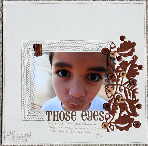
here is the layout i created in shades of brown…. it’s called those eyes.

“THOSE EYES” layout by Joscie Cutchens
~~~~~~~~~~~~~~~~~~~~~~~~~~~~~~
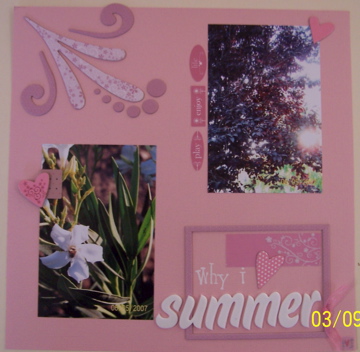
I’ve always wanted to do a single-color layout but probably wouldn’t have done it without this challenge. Here’s mine:
Materials: Bazzill cardstock; thickers-type letters from Dollar Tree/Miss Elizabeth; unknown ribbon; everything else from Heidi Grace kit I got at Tuesday Morning ($25 retail for $10).
I never do 2-photo layouts either, but these were 2 random photos I had taken in our front yard last summer & now they are scrapped!

7 Comments
Great layouts Erika! Love the pictures. Thanks for sharing them :}
What beautiful layouts Erika! I really love the first one! ;-)
You know what I just realized? That I have never really seen any of your LO’s until now. Do you ever post them on your blog or in the AMR gallery??
Anyways, love the LO. For some reason, I just love pink LO’s.
gorgeous LO!!! I love all the pink and the pictures!!
cute lo!
wowww! such a beautiful pink LO! and the borwn shades are truly amazing! now you inspired me.
Gorgeous layouts Erika. I do love monochromatic colour schemes. So much scope for texture and dimension.